one of my favorite art software (as of late) is new art academy on the 3ds. mandatory "it's actually really easy to hack your 3ds" (it's a stock phrase but it actually is! it's genuinely easy!), then you can pick up the cia on hshop.
all screenshots you see here are real size (took these with luma). finished paintings are twice this big, 640x480.


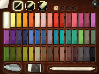
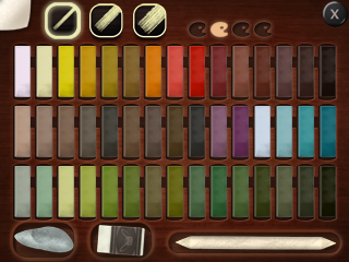
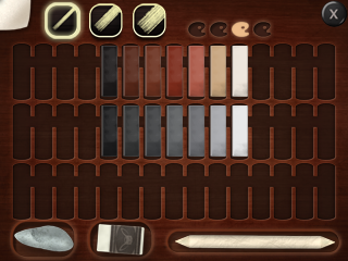
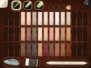
i prefer using pastels exclusively, and these are the colors i've got access to. i'm gonna refer to colors as page number - row number - column. i tend to focus on pages 3 and 4, because i don't like high saturation bright colors much, but the greyish colors on pages 1 and 2 are useful too (surprisingly saturated though), and those blacks are pretty dark. btw, on the 3ds screen i can't see the colors nearly as clearly as you see here. i tend to treat everything on 4-1 interchangeably. that's absolutely a feature not a bug.
ok so lemme walk you through a painting. this one was done for littleguns during artfight in about 40 minutes. for starters, i like using a dark background, i think i usually pick "fine paper" or something of that sort?
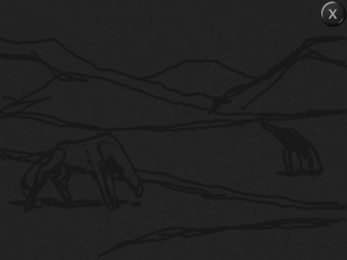
here's my sketch. the most important thing is getting the composition right, because i can't just lasso tool and move or transform things around. i avoid zooming in during this stage because it's harder to judge distances that way. i like using one of the page 3 blacks, they're not the darkest but still visible against the paper.
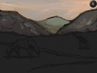
then it's time to paint; i don't like fixing the painting at any point so that i can always blend with things already on the canvas. this includes the sketch, so i clean it up if needed. i didn't here.
the background / landscape was kinda the focus here, so i started from the furthest point (ie the sky) and moved forward in "layers". when the character is larger i often paint it first. order of operations isn't that important. anyway, i use a middle size brush and change colors around to add variation. i tend to use the four lightest shades of page 3 and the entirety of 4-1. but only like. three or so colors. gray is actually pretty helpful because it's like a less literal (and saturated) blue, especially when put against something warmer.
the mountains were a little tricky. because of atmospheric perspective i wanted something blueish but not very dark or saturated. still with the middle brush, i used 2-3-2 and 4-3-3, and maybe some other misc greens in small amounts. you can see on the left side mountain that i cover the area very roughly with the darker color before adding some lighter tones on top, blending a bit as i go. i don't mind leaving gaps where the paper is visible, because i'll use the blending stick later on.
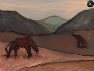
oops, draw the rest of the owl. ok, i forgot to take a screenshot just before detailing the grass. but don't worry, it's more of the same, using progressively lighter and warmer tones. middle ground was a lot of 4-3, in particular 4-3-3, 4-3-7 and 4-3-9, i wanna say. low saturation and relatively dark. when using multiple colors in a single spot like this i try to pick things around the same value. i'm careful to go around the creatures with a thin brush so i don't accidentally paint over them — again, i'm going back to front.
for the nearer planes, i went for the 4-2 row, with some 4-3s too. it's actually pretty pink (this is a skintone palette), but it doesn't seem like it in context. i used a bit of a darker shade just underneath the creatures and blended it out a lot too. as for the creatures, cold / low saturation browns are kinda tricky in this software, so i had to make do. they're 3-1-2 i believe, some extra shading through the sketch blending in, and just a little bit of a lighter tone (could be 3-1-3).
for details, i just made diagonal lines with the thin brush. generally speaking, the thinner brush is more "concentrated" and will show up better over colored areas. i used some 4-3-5 in the middle ground to add some extra color variation. i blended the middle ground more than the foreground, since it's further away and should have less definition.
here's the finished painting, full size. when a painting feels finished enough i zoom in so i'm actually seeing it at 100% size and do a final pass with the blending stick (medium or large), focusing on large light areas like the sky where i often have gaps where the black paper shows through — sometimes i only see these at my laptop which is very annoying. i'll soften lines here and there too, and add in tiny bright areas like eyes if applicable.
to get the images out, ftpd is very practical. the thinkpad has an sd card reader (thank god, i missed this so bad, hate adapters), but ftpd is less annoying if i need to fix something, since i don't have to turn the 3ds off and on all the time. images are jpgs and i think not progressive, so i usually open them on gimp and export them as such because those load better (not that they're large enough to matter), as well as pngs if they're not personal work (i shared one of these as a jpg on discord once and nearly cried from lossy compression).
um yeah that's it that's my progress. see you around ^_^